
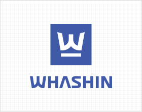
The Company's logo encompasses the letter ‘W’ and a wordmark on the right side.
The right-left balance is applied as the corporate identity. In particular circumstances, such as spatial constraints,
the vertical combination is partially permitted. The symbol and wordmark can also be separated and used individually.
The right-left balance is applied as the corporate identity. In particular circumstances, such as spatial constraints,
the vertical combination is partially permitted. The symbol and wordmark can also be separated and used individually.
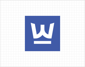
Vertical Combination
Partially permitted in particular situations
Symbol
Okay to be solely used
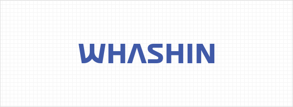
Word Mark
Okay to be solely used
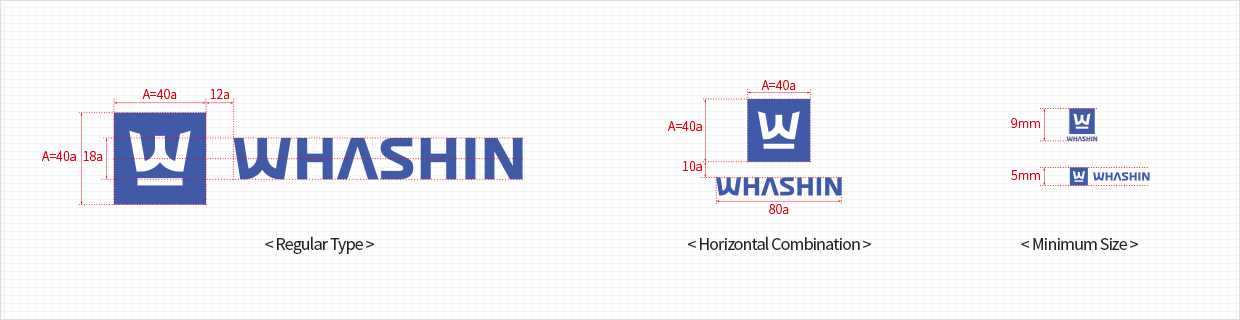
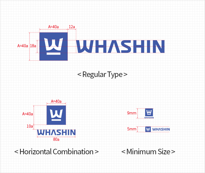
Rules of Proportion
If a logo is used, it should be represented in accordance with the rules of proportion as specified below.
Do NOT randomly adjust the elements, such as the gap and color.
If the logo is smaller than its minimum size, it could lose representation effects. Ensure at least the minimum size at all times.
Do NOT randomly adjust the elements, such as the gap and color.
If the logo is smaller than its minimum size, it could lose representation effects. Ensure at least the minimum size at all times.
|
Color
The logo is designed with blue and white. It could also be represented with single color depending on background and surrounding.
|
WS Blue
Pantone 2726C Black
Pantone Black C Silver
Pantone 877 C |

If the basic color is applied, make sure that white is kept, differentiating it from the blue color.

< Black >

< Silver >

< WS Blue >

< White >